DevMode
DevMode is a development-time inspection feature built into widgemo-core. When active, a Widgemo Inspector button appears on your Widgemo. Clicking it opens a modal showing your live rendered config as an interactive JSON tree, plus a summary of all detected interaction wiring — so you can verify exactly what Widgemo has received, see which defaults were applied, and confirm that your actions and event handlers are wired up correctly.
Enabling DevMode
DevMode activates automatically when NODE_ENV === 'development', so no config change is needed during local development.
For controlled environments outside development — such as a docs host, staging sandbox, or demo app — opt in explicitly:
// Shorthand — equivalent to { enabled: true }
const config = {
  devMode: true,
  zones: { ... },
};

// Object form — required when opting in outside development
const config = {
  devMode: {
    enabled: true,
    allowInProduction: true,  // required to show Inspector on non-development builds
  },
  zones: { ... },
};
Use allowInProduction: true only in trusted, non-public environments. It has no effect unless enabled is also true.
Inspector Button Placement
When DevMode is active, the Widgemo Inspector button appears automatically:
- Header zone present — the Inspector button appears as the rightmost button in the header zone
- Footer zone present, no header — the Inspector button appears in the footer zone
- No header or footer — the Inspector button floats at the top-right above the content zone
The Inspector
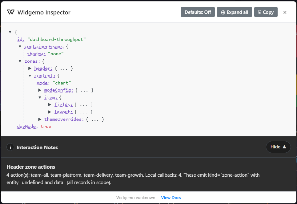
The Inspector modal has two panels: a JSON tree showing your active config, and an Interaction Notes panel below it.
JSON Tree
The JSON tree shows the full config object Widgemo received, including any defaults that were merged in. Keys are color-coded for readability:
| Color | Meaning |
|---|---|
| Purple | Keys |
| Green | String values |
| Blue | Number values |
| Red | Boolean values |
| Blue highlight | Keys added by default merge (visible when Defaults are toggled on) |
Keys that have documented metadata show a dotted underline — hover for type, allowed values, and default information.
Action Buttons
| Button | What it does |
|---|---|
| Defaults: On / Off | Toggles whether default-merged keys are shown and highlighted in the tree |
| Expand all / Collapse all | Expands or collapses the full JSON tree |
| Copy | Copies the currently displayed JSON to the clipboard |
| × (Close) | Closes the Inspector modal |
Interaction Notes Panel
The Interaction Notes panel summarizes how actions and event handlers are wired in the current config. For each zone that has actions, it lists the action IDs, the number of local onEvent callbacks detected, the interaction kind they emit (zone-action, item-action, etc.), and whether entity is defined for each kind.
Use this panel to confirm that your interactions.onEvent handler is registered and that actions are firing the right kind with the right context shape.
Practical Debugging Tips
- Config not behaving as expected? Open the Inspector and check whether the
zonestree matches what you intended — in particular look for missingmode, missingfields, or unexpected defaults that were applied. - Actions not firing? Check Interaction Notes — if local callbacks show
0, yourinteractions.onEventis not reaching this Widgemo. - Defaults obscuring your config? Toggle Defaults: Off to see only the keys you explicitly set; toggle Defaults: On to see the full merged shape with defaults highlighted.
- Sharing a bug report? Use Copy to paste the exact config in your issue or team thread so others can reproduce the same state.